Ecommerce UX Redesign CR Stationery Studio

Ecommerce UX Redesign
Product: Desktop eCommerce Website Duration: December 2021
I evaluated and redesigned the current checkout flow, and created and tested an interactive prototype.
Case Study Text
Overview
Company context:
CR Studio sells wedding stationary on their mobile-web experience. They need to enhance their browsing and checkout experience to greatly improve their product’s usability.
Project Brief:
A UX audit of the checkout flow revealed 2 main pain points to address
50% of users open on average 7 item pages and then abandon the site without moving any items into the cart. The hypothesis is that users are unable to determine which option is best based on relative features.
70% of users who place an item in the cart do not purchase. Data shows that users abandon the cart at the registration page. Right now, users must make an account to purchase. I will design a guest checkout to solve for this. The guest checkout must capture email.
BUSINESS GOALS:
Improve the conversion from browse to completion of checkout to increase revenue on the product’s website.
PROtotype:
eCommerce website
Industry Examples:
Zazzle, Happy Menocal, Rachel Rogers
Brand Personality:
An expert in the field who is always knowledgeable about the very latest trends and products in wedding stationary. Their designs are bright, luxurious, and contemporary–never fussy.
Target User:
24 - 45, 77% women, high income
Brand Attributes:
Chic, Personal, Dependable
The Process
UI
Create all content
Develop high-fidelity wireframes
Implement responsive design
Interaction design
User testing final design (UAT)
UX
Analyze market and competitive space
Perform heuristic evaluation
Information architecture
Design low-fidelity wireframes
User testing
Below is an overview of my work on this project, categorized into three phases:
Research
Design
Validate
1.
Research
Competitive Analysis
Heuristic evalutaion of existing site wireframes

secondary research
I investigated and synthesized relevant existing research. To summarize, the ideal user experience would be exciting and inspiring, while at the same time presenting information in the simplest manner possible, and keeping choices to a minimum. Users want to quickly gain an impression of the overall brand aesthetic and personality, as well as the general price range. Guest checkout is vital.
Sources: Material Design, Baymard Research Institute, Interaction Design Foundation
Secondary Research questions:
-
When products are in horizontal row, typical users focus less on the attributes which are on the column and spend more time looking at the products. In contrast, putting attributes in horizontal rows led subjects to compare a single attribute, such as price or other attributes.
Spotify is a great example of designing the premium choice to appear more appealing by using the length of list to show what my money is worth. Spotify also utilizes clever UI styling techniques to make the premium choice stand out.
-
For both desktop and mobile, the “Guest” option must be the most prominent option on the account-selection step — the upper-left option on desktop, and the top option on mobile.
Shoppers don’t like negative surprises. The more hidden costs and details you spring at them, the more likely they will and leave. For example, unexpected shipping costs are the number one reason buyers abandon their shopping carts – by a long shot.
-
3-4 options is best for this scenario. Separating the essential material from the secondary, less-likely-to-be-selected options is vital. If you have a complex process, you can use Hick’s Law to rationalize only presenting specific parts of that process at any one time on the screen.
Whilst more people click when they are advertised 24 options vs. 6 options, the purchase conversion rate is vastly higher when there is a smaller number of choices compared to a larger selection of choice.
2.
Design
User Flow Redesign

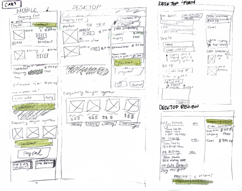
Sketching

Initial Wireframes

Product comparison chart

3.
Validate
User Testing
I ran 2 rounds of user testing with a total of 10 unique participants. In each round of testing, I Interviewed 5 people that fit into the app's target demographics. Interviews were conducted in person. Each interview lasted about 30 minutes. App must allow user to accomplish 3 main goals: (1) Find and compare information on products (2) view cart (3) complete guest checkout. Following each round of testing I made design changes as indicated by my findings.
Results

In the second round of testing, all users were able to complete all tasks and reported a strongly positive experience. 100% of users found that products and information were presented in a straightforward and aesthetically pleasing way. 4 out of 6 test subjects who are currently planning a wedding solicited stationery design services shown in the prototype, suggesting a 66% conversion rate for these target customers.
further development
As always, the scope of this project had its limits. Given more time, I would like to continue development in several areas. First and foremost, I would design and test mobile optimized prototypes. Additional options for payment method (such as PayPal, google pay) are a must. For form fills, I would implement "Real Time Info Confirmation" so users receive immediate feedback on the information they entered to reduce errors in context instead of waiting to validate at the end of the page. Finally, I would create and incorporate more dynamic content including video, micro-interactions, and animations.
Screens
Case Study Document


